Hello All,
Apologies if this has been asked before. I am a first time user of Grav (moving from Bookstack) and so far so good, I like it a lot.
However, when adding content to the top navigation menu using Klb4 theme, I have come across the scrolling issue. After adding in a number of pages which display fine in the navigation, it just drops off the screen and there is no way to see the items in the dropdown menu that are beyond.
Is there any way to make it so that when clicking the menu and going to the bottom, it scrolls to show the remaining items? Sometimes in other sites, you move the cursor toward the bottom of the menu and it starts scrolling.
Thank you.
Paul
Do you have an example? On demo site it scrolls fine
Thanks for getting back to me.
Attached is a screenshot of my site, the dropdown Documentation for Users menu goes beyond the bottom of the page where I have drawn the arrow, however moving the cursor down this menu, it just stops, there is no scroll in the menu for the remaining items to be visible.
In the demo site, I don’t have any dropdown menus from the top navigation menu to compare it to.
@paul222, I wonder if any user will be pleased with such a user experience… 
What’s the use-case that warrant such a long dropdown?
I think I agree with you. What’s the alternative, fewer pages and insert a TOC? (Or just change to a different theme like Learn2 which has a decent side menu).
@paul222, As always, it depends… And I cannot decide that for you.
You might consider taking a look the list of skeletons and try their demo’s.
You will see different themes using long menu lists. Some use a menu button that slides-in a sidebar, others have a fixed sidebar containing collapsing topics like the Learn site. And of course there are move ways that lead to Rome.
And please don’t be tempted to implement one of those horrible huge dropdowns that unfold on hovering the menu-bar and cover almost the entire page…
I thought the issue was on smaller screens where menu doesn’t fit, but as @pamtbaau noticed, such menu is a sign of bad page structure. If you really need such structure, I would consider not showing these pages at all in menu and listing them only on “Docs for users” page itself
Thanks both, that’s great advice and you are correct, it’s a horrible menu structure.
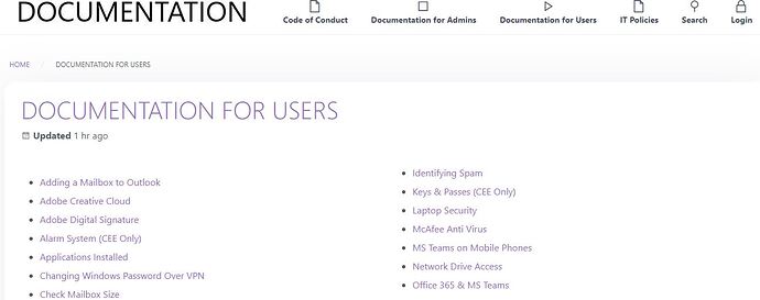
I have gone the route of removing the dropdowns, and having the links on the main Documentation for Users page instead, in the attached image. (I anticipate people using the Search anyway, but it’s good to have things listed somewhere, in case they don’t actually know what they are searching for).
A question regarding this new layout now. Is there an easy way to generate these URL’s on the page? The way I have done it is by adding in each URL manually, it’s not a big issue, however a bit time consuming as documents are added, they need to be added to the URL listing as well.
Thanks again,
Paul
You should have a template to list children and there could be something like in this example (sorry, can’t provide a ready to use solution now)


